 |
||||||
  |
||||||
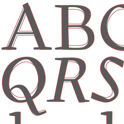
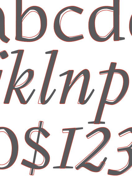
Gilman Sans regular and italic were directly derived from Gilman. The serifs were cut off and strokes were thickened and thinned where necessary. This process created a sans with features that are normally common to serifs. This can be seen most clearly in the italics and certain letter like P, p, k and more. Most importantly, the “human touch” of Gilman directly shows through to Gilman Sans.
|
|
|||||